There are still days when summer is just too hot, and there is only one thing that can improve the situation. That thing is a trip to Dairy Queen. I still remember when we would all pile into the car with my siblings. The anticipation built up as we waited to get our sweet, icy treat. As soon as we caught a glimpse of the sign, a large red and white ellipse that was slightly askew, we knew it was close. It was more than just their ice cream. It was the logo, the symbol of a bright and happy place, where everyone knew that something delicious awaited them.
And here’s the funny thing. The logo that has been the symbol of happiness for us for so long isn’t just some shape or color chosen randomly. There are many things one wouldn’t know if they were only concerned with the taste of the Dilly Bar or the Blizzard. To tell you the truth, it wasn’t a big issue for me. I didn’t really think about it as a child. The logo was simply there, as evident and unnoticed as the soft-serve ice cream it promotes. But as I moved into high school, I began to question the meaning behind the symbols I encountered every day. What’s so special about the Dairy Queen logo? Is it new, or has it been around for a long time? And what’s the message within it, if there is one?

Dairy Queen’s logo has evolved over the years since the company was founded in 1940. The company eventually replaced its original logo. It was quite different from the current logo of the company when it first opened its store in Joliet, Illinois and quite straightforward—a simple wordmark that read “Dairy Queen,” with a classic font that didn’t try to be anything more than what it was. It served as a nickname for a place that could give you some of the best soft serve ice cream out there.
Over time, designers have modified the logo to enhance the brand’s image. That’s why updates are necessary. In the 1950s, they refined the logo and placed the text inside an ellipse tilted slightly to the right. This was a significant change. It started the development of having Dairy Queen as a brand with its own unique appearance. The ellipse was not just skewed to give it a unique look. It made the logo look like it was in motion. This is synonymous with the fast and friendly services of any Dairy Queen outlet.

AD
In 1960, the company unveiled a logo that it would use for a number of years to come. This one was the most familiar. It had the red circle with the words ‘Dairy Queen’ in it, written in a clean and elegant font. However, the oval shape of this logo has sometimes been interpreted as a pair of lips. This makes the logo look welcoming and friendly, as if the brand is smiling at the consumer. This is the logo that most of us remember from our childhood. People connected it with the taste of ice cream on a hot summer day. The design was simple, without any noticeable extra features. But it looked elegant, decent, and cozy, which was fine.
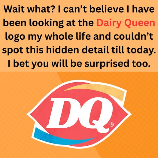
Later in the 1990s and early 2000s Dairy Queen made some modifications to the logo that is recognizable to this date. The text was replaced by the initials “DQ.” In 2001 the company decided that the logo looked a bit old-fashioned. The text “DQ” was enclosed within the red ellipse with blue and orange curved lines above and below the ellipse. These lines were not just decorative, as they represented the hot and cold line. Blue for ice cream, and orange for the hot foods. It was a good idea to put images that depicted the different products that Dairy Queen offers.
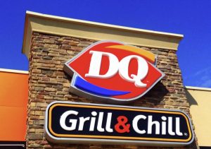
The current DQ logo that you can see on the signs, cups, and all the packaging in any of the DQ establishments still employs the red ellipse and the blue and orange swooshes. On the surface, you might not even notice the design, but there is actually quite a lot to it. The red ellipse represents the heritage of the brand. That is why it is still the main element of the logo. The swooshes emphasize that the brand has always been focused on quality. It is a shape that has become recognizable and popular. When people look at it, they can easily associate it with Dairy Queen. And yes, the lips icon still retains the attributes of warmth, friendliness, and fun associated with DQ.
The colors of the blue and orange swooshes also hold specific meanings. The blue swoosh is the direct indication of what this brand sells – ice cream, sundaes, Blizzards, and other frozen delights. The company introduced the orange swoosh to represent hot products, which became a key part of the DQ restaurant menu.All in all, these swooshes depict a brand that sells not only ice cream but also food. The hot, the cold, and the things in between.
It is also important to note the color scheme used in the logo, as it is a vital part of the design. The color red symbolizes energy, love, and enthusiasm. This is the kind of perception that DQ wants one to have when coming across their products. The blue gives a sense of calmness and renewal. This is something that is in line with the feelings one gets when having ice cream. The orange color is always vibrant and lively. It helps to bring all the elements together and add a touch of happiness to the design.
The DQ logo is a representation of a brand that was born in the state of Illinois as a small store and became an international brand. Every time I look at this red ellipse, I recall the past summer holidays of my childhood. It is a logo that has been adopted by today’s generation and still retains the original concept of DQ.
Next time you buy a Blizzard or a cup of coffee with the red logo, take a moment to appreciate the effort that went into creating that symbol. This is not just an inscription. It is the proclamation of something good, something that has been making people happy for more than eight decades now.